The New Look of PortalJS Cloud

William Lima

Yoana Popova
At PortalJS Cloud, we believe that managing and sharing open data should be effortless, beautiful, and accessible. That’s why we’ve launched a complete redesign of the PortalJS Cloud frontend—combining performance upgrades with a sleek, modern interface designed for everyone, from governments and non-profits to academic institutions and private organizations.
The new version offers a cleaner interface, enhanced accessibility, and lightning-fast search—making it the smartest choice for modern open data initiatives.
Let’s explore what’s new and how these improvements help you deliver a better data experience to your users.
What’s New?
A Revamped User Interface
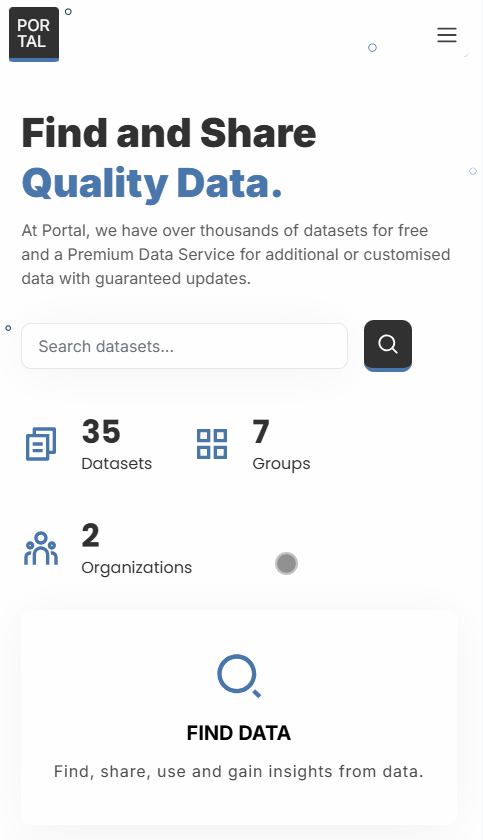
We’ve introduced a fresh, professional design across the entire portal. Pages like the homepage, dataset view, and search experience now feel smoother and more intuitive for all users.
- Modern, minimalist layout for a polished first impression:
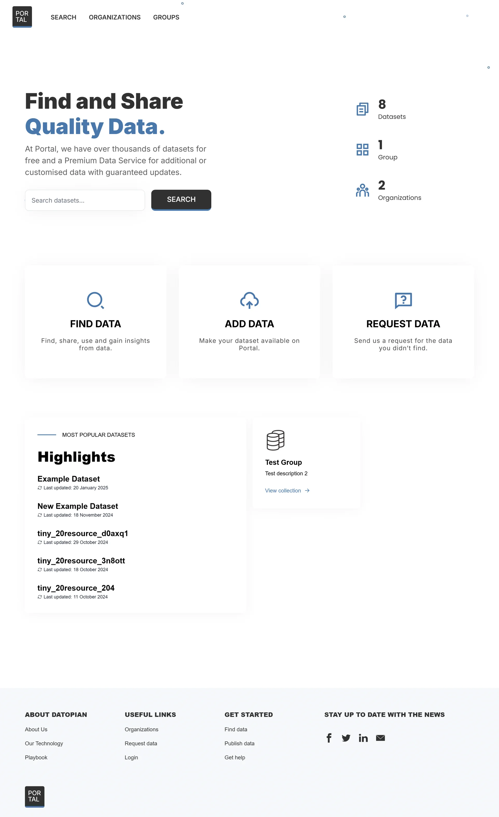
Home page
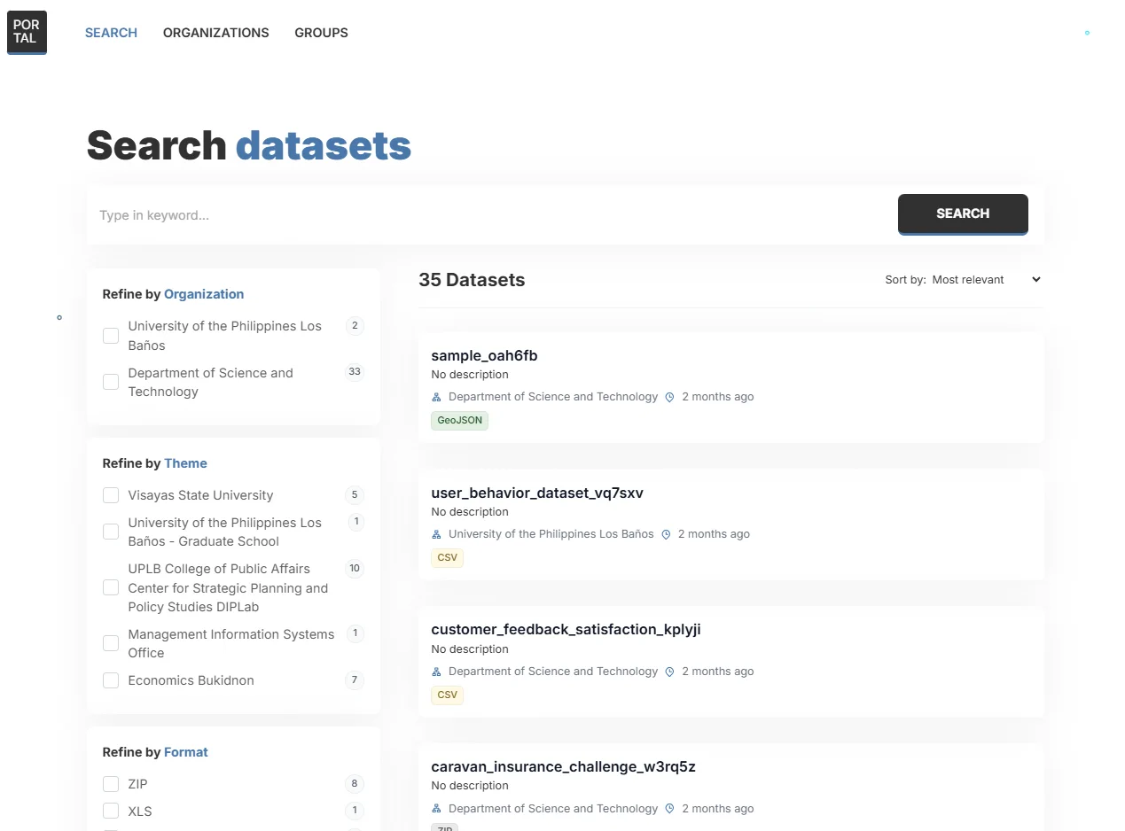
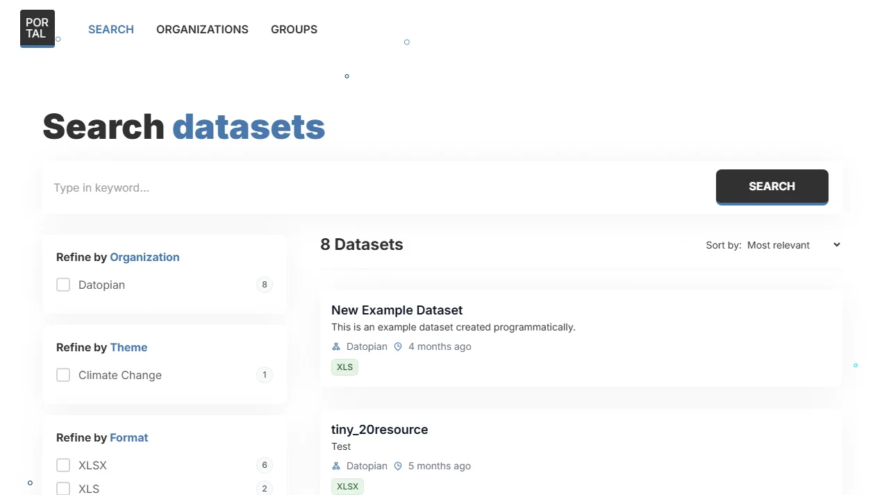
Search page
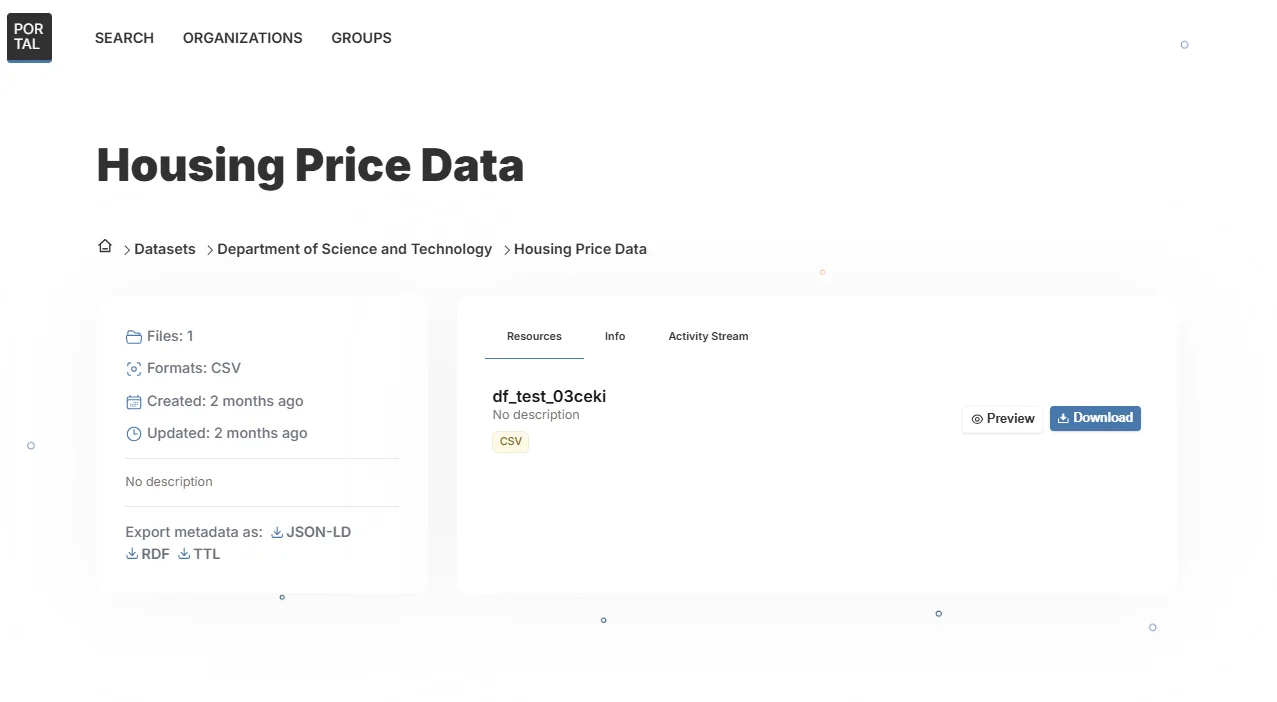
Dataset page
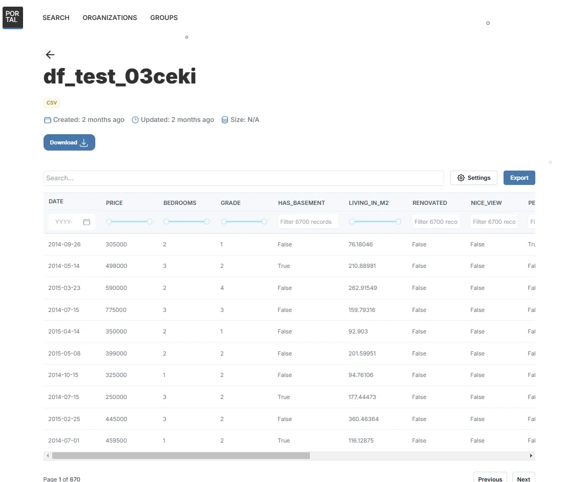
Resource Preview Page
-
Optimized for performance
-
Fully responsive across desktop, tablet, and mobile devices
-
Designed with accessibility in mind, meeting WCAG 2.1 / 2.2 standards
- All interactive elements (filters, tabs, buttons) are keyboard-friendly
- “Skip to content” navigation for screen reader users
Smarter Search & Filtering 🔍
We’ve made the search experience much easier and more powerful—especially when it comes to filtering and sharing results.
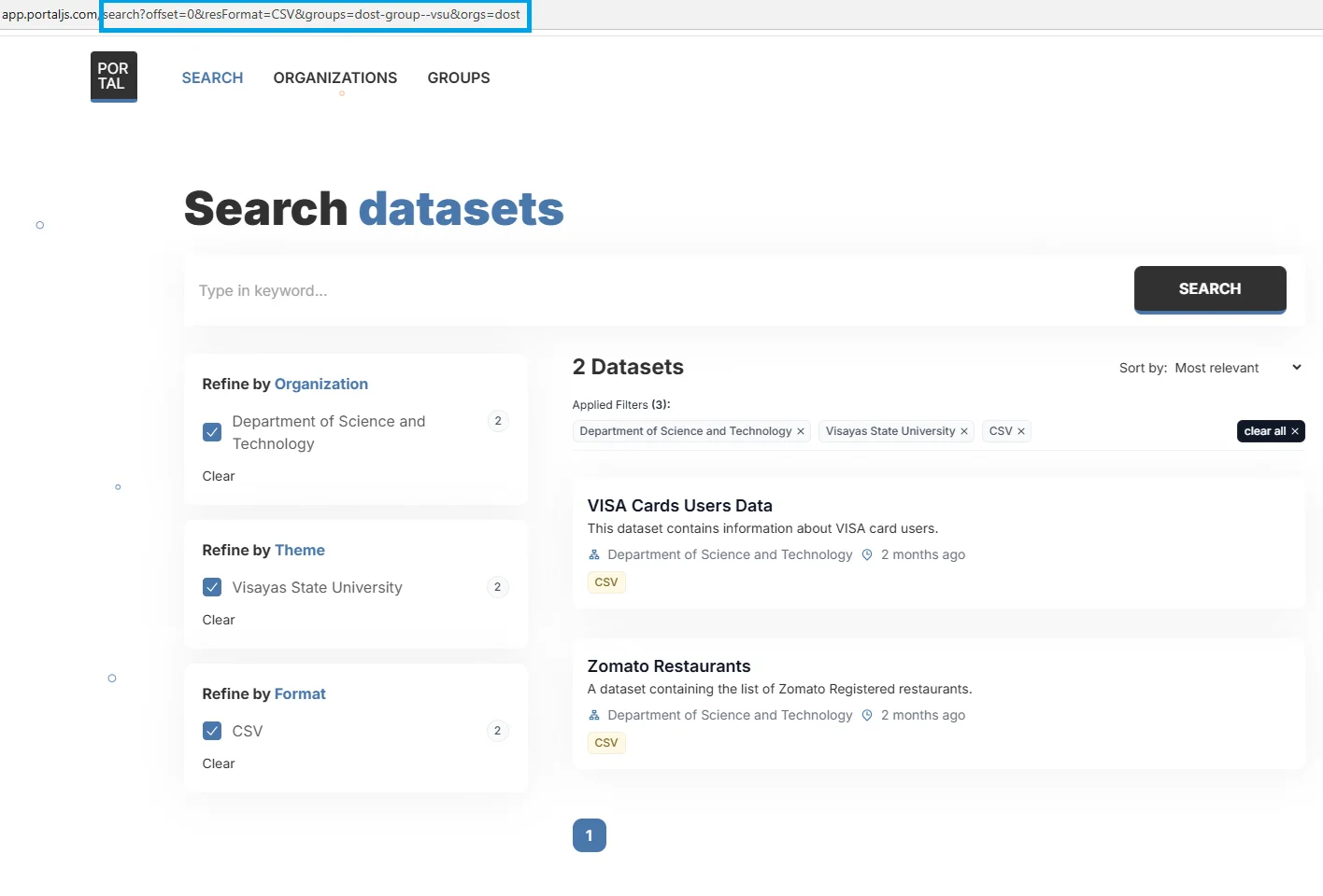
Shareable search results
We’ve rebuilt the search page so that every filter you apply—such as keywords, tags, or formats—is automatically reflected in the page URL. This is known as URL-synced search state.
In other words, the portal keeps track of your search settings directly in the web address.
What this means for the user:
Let’s say a user filters for “climate data from 2024”. The page URL will automatically update to reflect those filters. They can now copy that link and send it to a colleague, who will land on the exact same filtered view. No need to repeat the search.
Plus, filters are saved in the browser history. So if someone clicks on a dataset, they can use the Back button to return to their filtered results—just like browsing a regular website.
- You can copy and share the page link, and others will see the exact same filtered view
- Saved URLs can act like bookmarks, helping users return to specific filtered searches anytime
- The portal behaves more like modern apps, where your current view is always reflected in the URL
Minimal state usage
In web development, "state" is the information a page keeps track of while you’re using it—like which filters you’ve applied or what search terms you’ve entered.
We’ve made sure that the search page in PortalJS Cloud only stores the essential state. This means the system isn’t overloaded with unnecessary data, making everything simpler and faster behind the scenes.
What this means for the user:
- Pages load faster
- Filters respond instantly
- The portal is more stable—even with large datasets
- Less chance of bugs or crashes
Faster and more reliable behind-the-scenes logic with React Context (no more prop-drilling)
Previously, when different parts of a web page needed to "talk" to each other (for example, when a filter affected the search results), the data had to be passed through multiple layers—like a game of telephone. This process is called prop-drilling, and it can get messy and hard to manage.
Now, thanks to improved architecture (using something called React Context), all search filters and components stay in sync automatically—without needing to repeat the same logic in multiple places. Think of it like everyone checking the same live dashboard instead of passing sticky notes around.
What this means for the user:
- The search page is easier to maintain, faster to load, and more robust
- All filters, search bars, and results stay perfectly in sync
- No lag, no glitches—just smooth, instant updates without reloading the page. The technology behind the scenes is optimized to deliver results quickly, even on slower internet connections.
- New features and filters can be added quickly without breaking anything
These upgrades make it easier for users to find the data they need—and to share it with others.
Better Data Visualizations 📊
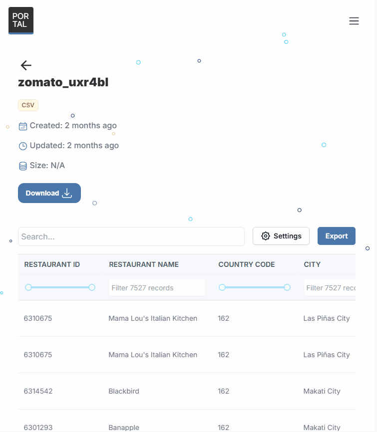
We’ve significantly improved the CSV preview component to make exploring data easier, more accessible, and more interactive.
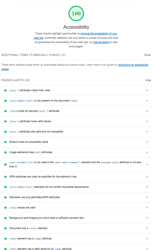
Accessibility-First Design
The preview is now fully compliant with WCAG 2.1 / 2.2 standards, meaning it works smoothly with keyboard navigation and screen readers. Users can tab through rows and columns or use assistive technologies to understand and interact with the data.
New Interactive Features
We’ve added powerful new tools to help users make sense of large tables:
- Search within the table – Instantly find specific columns or values.
Example: type “GDP” and jump straight to that column or row. - Column selector – Choose which columns to show or hide.
Great for reducing clutter when working with wide datasets. - Pagination control – Browse large datasets more easily, page by page.
- Export to JSON – Download the data in developer-friendly format for further analysis or integration.
Form & Filter Accessibility
We’ve upgraded all form and filter components to be fully accessible (see Accessibility improvements screenshot above).
- Accessible labels – Every input field, dropdown, and button now has a proper label that screen readers can detect and announce.
- Live filter updates – When a user applies a filter, screen readers now receive real-time feedback about the change.
For example, “3 datasets found for your selection” is announced automatically.
What this means for the user:
- People using screen readers or keyboard navigation can interact with forms just as smoothly as others
- Everyone can confidently use filters and forms, knowing exactly what’s happening on the page
- Your data portal is more inclusive, user-friendly, and aligned with accessibility best practices
Visual & Semantic Structure
Beyond visual design, we’ve made deeper improvements to the way the site is structured under the hood (see Accessibility improvements screenshot above).
- Verified color contrast – All UI elements now meet recommended contrast ratios, ensuring readability for users with low vision or color blindness.
- Semantic HTML and ARIA roles – We’ve reorganized the site structure using proper tags (like headers, sections, and landmarks), and added ARIA roles to give screen readers clear context and navigation cues.
What this means for the user:
- Text and buttons are easier to read in all lighting conditions
- Assistive technologies can “understand” the layout and flow of each page
- The portal feels more predictable and intuitive for everyone, including users with disabilities
Easy Customization, Delivered Fast
Want to match your data portal to your brand’s color and logo? No problem. We’ve made it incredibly simple for our developers to update key visual elements like:
- Main template color – Choose a color that fits your brand
- Portal logo – Upload your organization’s logo in seconds
These changes are configured via .env variable:
NEXT_PUBLIC_THEME_COLOR and NEXT_PUBLIC_PORTAL_LOGO
For example:
NEXT_PUBLIC_THEME_COLOR=#8847cd
NEXT_PUBLIC_PORTAL_LOGO=/images/logos/purple.jpg
What this means for you:
If you need a color or logo update, we can make the change and deploy it almost instantly—no long wait times, no messy custom coding. Because we’ve built it smart from the start.
Why Did We Change It?
- The old template had some outdated design elements and usability gaps.
- We wanted to ensure first-time users have a smooth experience setting up their portal.
- Aligning with modern web standards makes the portal more maintainable and professional.
- Compliance with accessibility standards was a priority (more on that in our accessibility article).
Why We Redesigned PortalJS Cloud
We didn’t just give PortalJS Cloud a facelift—we rebuilt it with purpose.
The previous design, while functional, had limitations. Some visual elements felt outdated, and usability gaps made it harder for new users to get started quickly.
So we took a step back and asked: What does a modern data portal need in 2025?
The answer was clear:
- A clean, intuitive interface that welcomes first-time users
- Streamlined performance across all devices
- Built-in accessibility, ensuring everyone can navigate and explore data
- A future-proof foundation that aligns with today’s web standards—and tomorrow’s
You can read a bit more about why compliance with accessibility standards were a priority in our accessibility article.
This redesign is about helping governments, non-profits, researchers, and companies launch professional, user-friendly data portals—faster and more efficiently than ever before.
👉 Try the new PortalJS Cloud today with a free 14-day trial—no credit card required. Experience the new look, lightning-fast performance, and modern accessibility, all in minutes.
Before & After Comparison
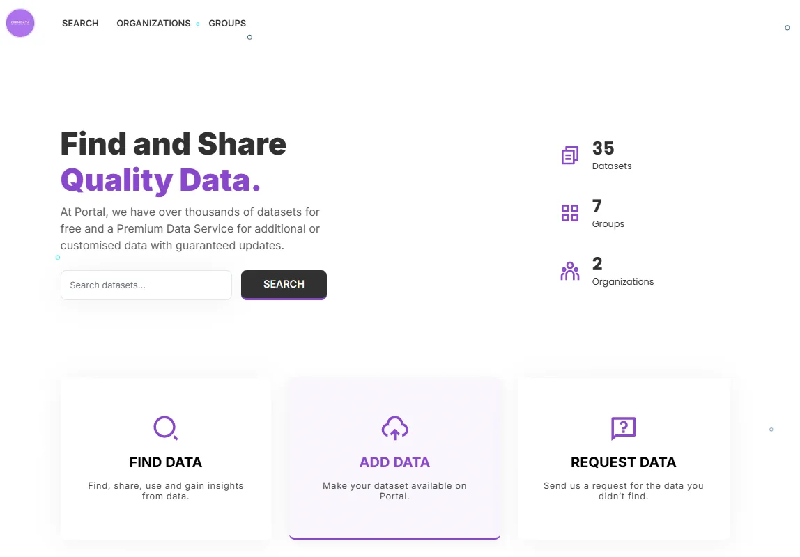
 Homepage before
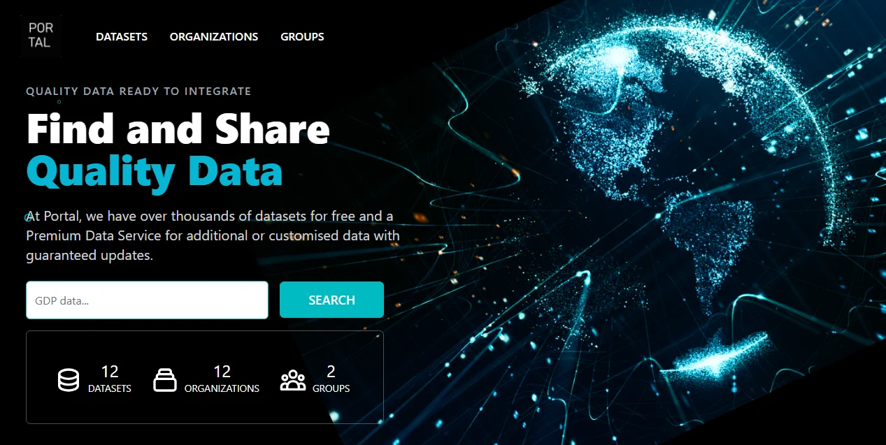
 Homepage after
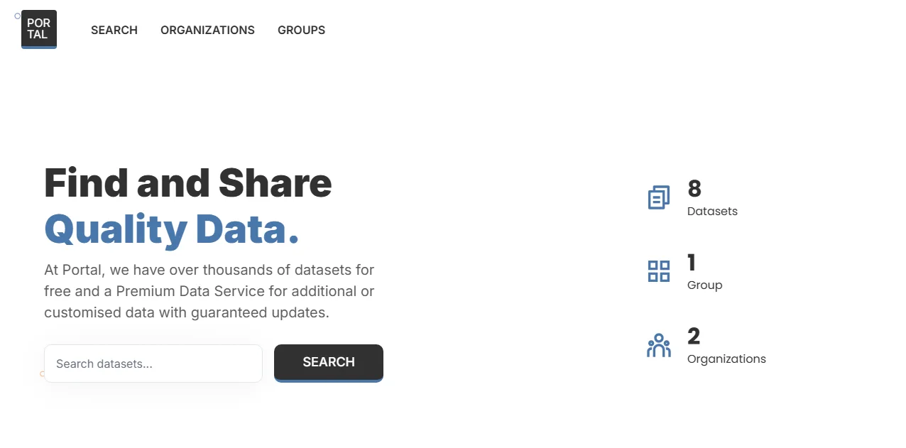
 Search page before
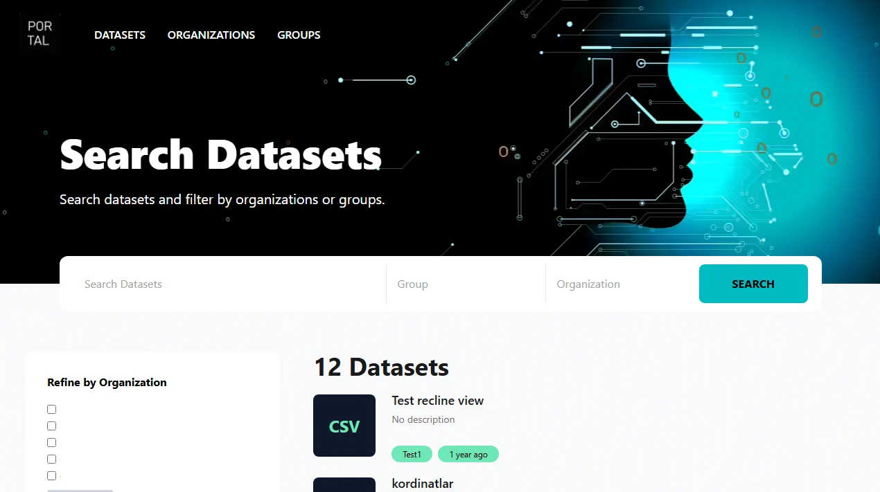
 Search page after